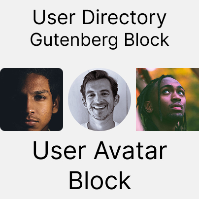
Meet the User Avatar Block
When you’re building a user directory, community site, or membership portal, a user’s photo can make all the difference. The User Avatar Block lets you display user profile pictures beautifully and consistently across your site, from compact lists to full-page profiles. Whether users upload their own images or rely on fallbacks, this block ensures every profile looks polished.
Let’s explore how this block works, how to customize it, and how you can make the most of it in your designs.
What is the User Avatar Block?
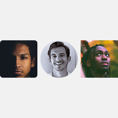
The User Avatar Block is part of the WPUF User Directory system and is designed to display profile photos for your users. It acts like a dynamic “photo frame” that automatically pulls the right image for each user. Ideal for directories, team pages, or profile layouts.
Key Features
- Display each user profile pictures
- Choose avatar size (Small, Medium, Large, Extra Large, or Custom)
- Customize avatar shape (Circle, Square, Rounded)
- Handle missing profile photos with fallback options
- Use initials or Gravatar as fallbacks
How to Use the User Avatar Block
Step 1: Add the Block
- Open any User Directory or User Profile block.
- Click the + icon to add a new block.
- Search for “User Avatar”.
- Select WPUF – User Avatar from the block list.
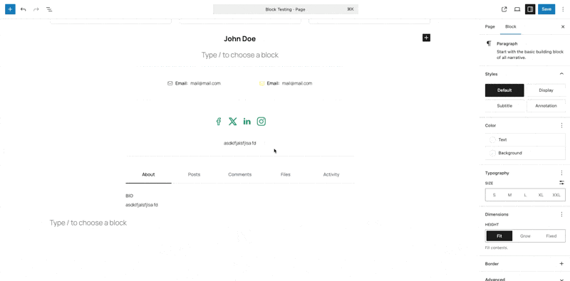
Step 2: Configure the Settings
Once added, click on the block to open the settings panel on the right. From there, you can control everything. Size, shape, and fallback behavior.
Block Settings Explained
Avatar Size
Choose how large you want the profile photo to appear:
- Small (32px) – Compact, great for lists
- Medium (96px) – Perfect for directories
- Large (150px) – Best for profile pages
- Extra Large (300px) – Ideal for featured users
- Custom – Set a specific pixel value (32px to 600px)
- If you pick “Custom,” you can define the exact size (between 32px and 600px).
Use this to match unique design layouts or branding requirements.
Avatar Shape
Decide how avatars are styled:
- Circle – Modern and friendly
- Square – Clean and professional
- Rounded – Balanced, soft-cornered design
Fallback Type
Choose what appears when a user has no uploaded photo:
- Initials – Displays user initials in a styled background (default)
- Gravatar – Pulls from the Gravatar service if available
- The block automatically prioritizes available profile photos.
- If none exist:
- It tries Gravatar (if selected).
- Otherwise, it shows Initials by default.
Unlock the User Directory module with WPUF Professional and start showcasing your users beautifully. Get it directly from weDevs site.
Best Practices
Size Recommendations
- Lists: Small to Medium
- Profiles: Medium to Large
- Featured areas: Large to Extra Large
Shape Recommendations
- Circle – Modern, social feel
- Square – Professional, clean look
- Rounded – Versatile, balanced
Fallback Recommendations
- Initials – Best default (always available)
- Gravatar – Great for communities with existing Gravatar users
Troubleshooting
No Avatar Showing?
- Check fallback type (Initials or Gravatar).
- Make sure user data is loaded.
- Test with different users.
Avatar Too Small or Large?
- Verify the size option.
- Keep custom sizes within 32px to 600px.
- Check your theme’s layout constraints.
Shape Looks Off?
- Confirm the shape setting.
- Try different shapes to isolate CSS conflicts.
- Clear your cache after making changes.
Fallback Not Working?
- Make sure the fallback type is selected.
- Ensure the user has a display name (for initials).
- Test with multiple accounts.
Styling and Customization
Built-In WordPress Styles
The block supports:
- Margins and padding
Custom CSS Example
/* Enlarge avatars slightly on hover */
.wpuf-user-avatar:hover img {
  transform: scale(1.1);
}

/* Add a subtle shadow */
.wpuf-user-avatar img {
  box-shadow: 0 2px 4px rgba(0,0,0,0.1);
}
Combine With Other Blocks
Pair the User Avatar Block with:
- User Name Block – for profile cards
- User Bio Block – for team pages
- User Contact Info Block – for directories
- Profile Button Block – for clickable cards
These combinations help you create flexible, professional user layouts.
FAQ
What if a user doesn’t have a photo?
The block automatically shows initials or pulls from Gravatar, depending on your fallback setting.
Can I use custom image sizes?
Yes! Choose “Custom” and set any pixel value between 32 and 600.
Does it work with all WordPress themes?
Yes. The block follows your theme’s styles, and you can override with CSS if needed.
Can I use it outside the User Directory block?
It’s primarily designed for the WPUF User Directory and Profile blocks. So it should not work outside the WPUF User Directory or User Profile block.
How can I make avatars load faster?
Use optimized images, caching plugins, and avoid unnecessarily large sizes.
What’s Next?
You’ve mastered the User Avatar Block, the visual cornerstone of user profiles.
Next up in this series, we’ll explore the User Name Block, where you’ll learn how to display names dynamically and combine them with avatars for beautiful user cards.
Stay tuned for the next guide!
Leave a Reply